Dashboard Design for Decision-Making: A Portfolio Case Study
The dashboard had all the data. It still couldn’t answer the question.
My client managed a home-service portfolio of 25 brands and approximately $700,000 in monthly ad spend. For this case study, I’ll call it Home Service Portfolio Company.
They asked me to add three metrics to their marketing dashboard in Looker Studio: Impression Share, Impression Share Lost to Budget, and Impression Share Lost to Rank.
Client and brand names have been replaced. All dashboard figures shown are illustrative, altered values—not actual client results.
It was a reasonable request. So I added them.
Then I looked at the page. It had more information, and it was harder to use.
The table already held roughly 20 metrics. Spend, leads, appointments, revenue, and acquisition costs competed for attention. Three more columns exposed the real design problem: information overload. The user was pulled in several directions, and the question the page was meant to answer was hard to find for anyone who didn’t use the dashboard daily.
Why adding metrics made the dashboard harder to use
Each column had a reason to exist. Together, they left my client to do the organizing: find a problem, choose the relevant numbers, trace it to a campaign, and decide what to change.
That is a lot to ask of someone opening a report between other responsibilities. It is even more to ask of someone returning to the page after several weeks away.
The earlier reporting view below shows the problem: a wide table gave costs, funnel measures, business outcomes, and impression-share diagnostics similar visual weight.
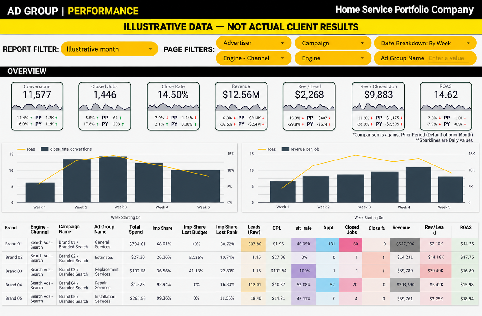
Before: overview charts and a wide table gave many metrics similar visual weight. Illustrative data—not actual client results.
The question that changed the rebuild
I asked my client how they actually used the page, what problem they were trying to solve, and what decision they were trying to make.
“If a campaign is unhealthy, which ad group is the culprit? And for each ad group, does it need action now, or is it fine and not worth my time?”
My client described a decision-making sequence: check brand health, find the campaign driving the result, isolate the ad group, then decide whether it needs action. The page needed to follow that sequence.
This is the principle behind our Modern Marketing Decision System: connect the numbers to the next decision. If your reporting stops at “what happened,” download the free five-page guide. Start with one business outcome and trace it backward to see where your own decision path breaks.
Here’s a repeatable process to make this work for you.
1. Brand: decide where to look
The opening view answers: which brands deserve attention? If you’re working with one brand, start by comparing its channels.
Because we had already connected reliable data from lead to customer, my client could start with Sit Rate—the share of raw leads becoming appointments—and margin-adjusted value per appointment after acquisition spend. One shows lead progression; the other adds economic context.
We separated brand health by channel so Search and Local Services could be evaluated independently. Combining them into a single average could hide the difference my client needed to see.
A scatter chart puts Sit Rate and margin-adjusted value per appointment in the same view, with bubble size representing total spend. The table supplies the detail. The aim is to choose where to investigate before reading every row. This is where a business intelligence tool like Looker Studio shines. My client can click an underperforming brand in the scatter plot to filter the campaign and ad-group views below. One selection turns the overview into a focused investigation.
2. Campaign: find what is driving the result
A brand-level data point can signal a problem without revealing its source. My client described a brand where siding and windows were strong while roofing was dragging down performance. The campaign section narrows to the selected brand and carries forward the same health measures. That lets the reader identify which campaign needs attention without learning a different set of signals at every step.
Using the same visual language at each step makes the workflow easier to follow and more familiar with repeated use.
3. Ad Group: isolate the search theme
Within this client’s campaigns, ad groups represent themes such as metal roofing, roof replacement, roof inspection, or general roofing. That makes the ad group a useful next level of diagnosis.
Which theme is pulling its weight? Which produces leads that rarely become appointments? Where are acquisition costs out of line with the value being generated?
Sit Rate, cost per lead, and margin-adjusted value per appointment sit alongside spend and lead volume. Actual CPL also has a comparison point: Max CPL, based on that segment’s funnel and job economics. A standalone dollar figure cannot provide that context.
4. Action: give the supporting metrics a job
The three requested metrics now have a place in the investigation. After identifying the relevant segment, my client can use impression-share data to examine constraints on visibility alongside its economics.
There is an important boundary: Google reports Search Lost IS (budget) at campaign level only. Budget loss should be presented as campaign context, not as an independently measured ad-group result. Ad-group impression share and rank loss can support the deeper investigation where available.
Low impression share alone is not a reason to spend more. The team first needs to understand whether the leads and appointments justify more investment.
Low Sit Rate: investigate search terms, keyword intent, and ad copy.
CPL above the segment’s limit: investigate acquisition cost and waste.
Appointments are coming through, but economics remain weak: review job value with the business and consider whether spend belongs in a different search theme.
These are investigation paths, not automatic instructions to pause an ad group. The final judgment still belongs to the people managing the account and the business.
Make the page teach the workflow
Cross-filtering connects the sections: click a brand to narrow the campaign and ad-group views, then click a campaign to drill in further. Click the selection again to clear it. Short instructions make this explicit for an occasional user.
We moved the legacy reporting into a detailed reference section. The information remained available while the diagnostic sequence became the main experience.
The rebuilt dashboard below puts brand health first, campaign investigation second, and ad-group detail next. Both views use illustrative figures. Compare the layout and decision sequence; these images do not demonstrate a change in business performance.
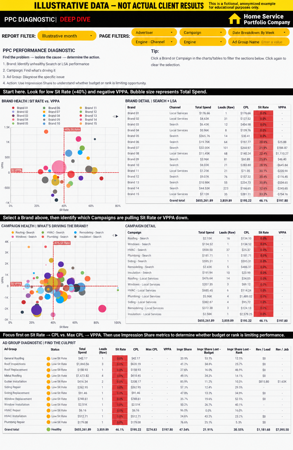
After: Brand → Campaign → Ad Group → Action gives the report a diagnostic sequence. Illustrative data—not actual client results. Budget-loss fields are campaign context, as explained above.
Keep the definitions and guardrails visible
These definitions refer to this portfolio report and its selected date range and segment. They are not universal benchmarks or accounting definitions.
Sit Rate: appointments divided by raw leads, using this portfolio report’s modeled funnel data for the selected period.
CPL: total spend, including the agency fees used in this report, divided by raw leads for the same period and segment.
Margin-adjusted value per appointment: modeled VCM (Variable Contribution Margin) revenue minus total spend, divided by appointments for the selected period; this is the report’s margin-adjusted acquisition measure, not company net profit.
Max CPL: Sit Rate × appointment close rate × modeled VCM revenue per approved job, using the same report period and segment as actual CPL.
Search impression share: received Search impressions divided by estimated eligible Search impressions for the selected Google Ads period and supported entity level.
Keep lead volume next to rates. A handful of leads should not carry the same confidence as a persistent pattern with meaningful spend. Preserve missing values as missing, make data freshness visible, and retain Brand → Campaign → Ad Group identifiers so similarly named ad groups do not get merged.
Calculate these measures once in the modeled data source and reuse them across the report. A cleaner layout cannot compensate for inconsistent definitions.
What changed—and what remains unmeasured
The first version has been sent to my client for feedback. The demonstrated change is structural: the report now follows their diagnostic sequence, with visuals to direct attention and tables to support investigation.
We have not yet measured time saved or a campaign-performance lift. The next usability test is concrete: choose a brand with a known issue, find the relevant campaign and ad group, and explain the next action. Record time to diagnosis, points of hesitation, and whether the conclusion is supported by the data.
A five-question dashboard design check
Before adding another chart or metric, ask the person who uses the report:
What decision are you making when you open this page?
What tells you where to look first?
What do you need to compare or drill into next?
What evidence would change your action—or tell you to leave things alone?
Could you follow that path again a month from now without someone explaining it?
Use those answers to establish the order of the page. Give every metric a role in the process, keep supporting detail available, and make the next step easy to find.
Give your own reporting a decision path
You do not need a 25-brand portfolio to use this approach. You need one real decision your current reporting makes harder than it should be.
The free Modern Marketing Decision System guide gives your team a shared starting point: trust the numbers, follow the money, and decide what to keep, fix, scale, cut, or investigate. It is five pages, about a 15-minute read, and easy to share with the people who use your reports.
Download the free Modern Marketing Decision System guide →
As you read, pick one business outcome and work backward from revenue to customer, qualified lead, lead, and spend. Find the first connection your team cannot explain confidently. That is a practical place to start improving the system.
Want help choosing where to start? Take the three-minute Marketing Decision Assessment for an initial diagnosis before you enter an email address.
Jamie Schild is the founder of Signal Ridge and builds KPI systems and reporting tools for marketing agencies, home service businesses, and owner-led teams. Read more about Jamie’s background.